content-visibility: auto;
When you open a webpage, your browser doesn’t just display what you see.
It performs a series of heavy operations behind the scenes:
- Layout: Calculating the position and size of every element.
- Paint: Filling pixels for all those visual boxes.
- Compositing: Layering everything together for the final frame.
The issue?
Browsers do all of this work — even for elements below the fold (not yet visible).
That’s where one underrated CSS property quietly changes everything:
content-visibility: auto;
What It Does
It literally tells the browser:
“Don’t render this element until it’s visible in the viewport.”
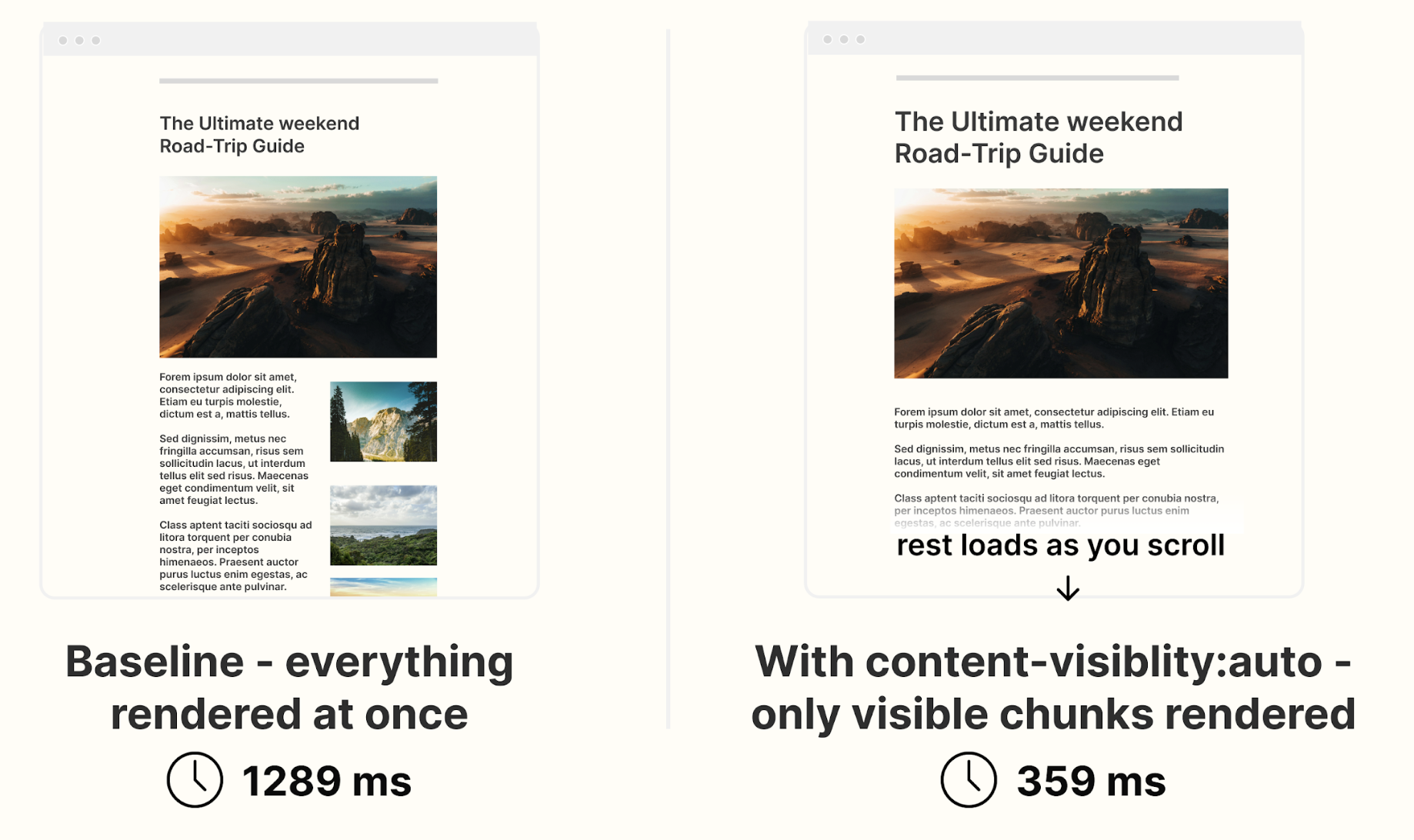
When applied, the browser skips layout, paint, and rendering for off-screen elements —
while still reserving their layout space to prevent jumps or reflows.
.section {
content-visibility: auto;
}
Under the Hood
- content-visibility adds layout, paint, and style containment automatically.
- When the element is off-screen, the browser skips rendering its children.
- As the element scrolls into view, rendering happens just in time — natively, no JavaScript observers required.
For layout stability, use:
.card {
content-visibility: auto;
contain-intrinsic-size: 1000px; /* Placeholder height */
}
- This helps prevent CLS (Cumulative Layout Shift) when content becomes visible.
Real-World Performance Gains
According to Google Chrome Developers and web.dev:
- Large content-heavy pages (e.g., dashboards, blogs, product feeds) saw 50–70% faster initial render times.
- Memory usage dropped by up to 30–40% because the browser ignored off-screen content.
- Scroll FPS improved significantly since fewer layers were rendered per frame.
In one official web.dev demo, initial render time dropped from 232 ms to 30 ms — a 7× improvement.
DebugBear confirmed similar results on long lists and feeds, improving Lighthouse Performance Scores and reducing Total Blocking Time.
When to Use It
Perfect for:
- Long article lists, feeds, or infinite scroll UIs
- Below-the-fold landing page sections
- Large admin panels and dashboards
- Product grids and review listings
Avoid using on:
- Sticky or fixed headers/footers (may flicker)
- Elements whose height dynamically affects nearby layout
- Components that depend on getBoundingClientRect() before being rendered
Browser Support
Supported in:
- Chrome 85+
- Edge 85+
- Firefox 128+
- Opera 71+
Added to Baseline 2024 (so it’s now part of the standard set of safe, production-ready features).
If unsupported, it’s silently ignored — meaning no layout breaks.
References:
- web.dev — “content-visibility: the new CSS property that boosts performance”
- Chrome Developers Blog — “CSS content-visibility is Baseline”
- MDN Docs — CSS content-visibility
- DebugBear — Real performance testing with content-visibility
- Smashing Magazine — “Boosting Performance With CSS Containment”
Why Yutitech Cares
At Yutitech, we don’t just build UIs —
we engineer browser empathy.
Understanding how the browser thinks lets us craft interfaces that feel instant, even on slow networks or mid-range devices.
Sometimes, a single CSS line can save hundreds of milliseconds of rendering cost.
That’s what we call Invisible Engineering